

BofA app redesign:
BofA LITE

BofA Lite is a lightweight banking app for the younger generation. It is designed to ensure that the app meets the expectations of today's young users to bring user loyalty and steady user growth to the company.
Product Manager
Engineer
UX Researcher
Product Designer
Duration
Tools
3 Months + Iteration
Figma & Protopie
Responsibilites
Collaboration
BACKGROUND

It all starts with one question:
How often do you open your banking app?
As a college student, I rarely use my BofA app, primarily for transferring funds and paying bills. As a UX designer, I've recognized usability issues in the BofA app, particularly among younger users.
How might we make it better?
HMW enhance users' engagement in BofA?
HMW strengthen users’ loyalty to the product, motivate target users to use BofA more often?
HMW use technology to make it more efficient?
How can we help the business and users?
Referring to the 2022 Deloitte back-to-college survey, younger generations are facing heavier financial pressures and more credit card usage.
The existing app structure is redundant for young users who want to choose BofA. Most provided functions are not used and some of the frequently used ones are too hidden.
Our primary focus is capturing the young generation as customers, and redesigning the current app strategically to create a seamless path toward financial independence. Simultaneously, we aim to align with our long-term goal of cultivating unwavering customer loyalty for business growth.
Outcome
Task Completion Time
⬇**%
Task Completion Rate
⬆**%
User Satisfaction Rate
⬆**%

A SNEAK PEEK

The UX process takes 3 months.
RESEARCH
BofA mobile banking is a bitter-sweet experience

The app was built as a virtual bank, squeezing the user experience of commonly used functions.

Looking at the fin-tech industry,
it SUCKS :(
Banking apps offer mostly similar features, offering too many and too complex features.
Luckily, we found some Send & Transfer apps targeting young people with limited functionality but a good user experience.

There are many fin-tech products for younger generations, but not banking apps. Can we design a lite but user-friendly version of the BofA app with the younger gens as the target audience?
The current app does not align with their preference
By researching popular apps, younger gens value on
Concise Information
Interactive Features
Visual Contents
Instant Gratification
Messaging
Emojis and GIFs
App Efficiency
…

Unfortunately, the current version of the BofA app is not fully in line with the preferences of young people.
but they are decisive for BofA mobile’s experience
Large user base, high engagement, market leader
A Cornerstone of BofA's Digital Success
In the US, 19% of 18-29 year olds stated their main bank account is at BofA.
By 2022, BoA will record 68M consumers. At least 12% of them are in their 20s.
BofA’s market share in 2022 is 13.98%, the second highest in the US.
BofA’s app records 56M verified digital users and 11.6B login times in one year.
Tech-savvy, financially-conscious, future customers
Digital Natives with long-term Potential
They are familiar with smart devices and have a lower learning curve.
They have clear needs and pain points with the current BofA.
They have stable growth and are about to enter society, which can bring long-term benefits to the company.

Therefore, given our existing knowledge of their needs and preferences, their pivotal role as future customers, and their potential for long-term loyalty, designing a streamlined BofA app tailored to young users is not only feasible but imperative.
Target Audience
A lite version of BOFA app is for

A clear goal
Simplicity, Convenience, Reliability
Referring to 30+ samples from surveys & interviews, young users open their BofA for no more than five reasons, and the top three are transferring, paying, and checking statements. 60% of respondents had their account features restricted or had to spend more due to misuse.
Less > More
Finishing small operations in quick time > solving comprehensive financial problems. Satisfaction is based on whether the most basic functions are addressed.
Easy > Saving
The young generation wants to use the minimum cost to save money. They're willing to save, but they don't want to spend too much time on it.
No Loss > Gain
Information can be little but must be reliable. Emphasizing alerts to reduce the possibility of loss, security, and accurate information is very important.
Quality > Quantity
Young users have a very strong ability to adapt apps. They will not have very obvious favors or dislikes for different apps, but they are very sensitive to any unfriendly design or updates.
Persona

Annette Black
Student in Commu
22 years old
Female
Anne looks at the banking app 3-4 times a month to see what's going on, usually to transfer money, take a look at the statement, and check for any alerts.
She has limited knowledge of the app's functionality. She has had her account closed for multiple transfers and has been scared ever since.
When she is bored she browses deals for fun. Anne is also in the habit of bookkeeping, but she is currently bookkeeping in other apps because they look cuter.
Problem Reframing
Now, how might we make BofA app better?
HMW encourage Anne to open the app more often?
HMW design a visual language more relevant to the Anne’s preference?
HMW reduce Anne’ operating errors?

DESIGN
What functions?
After evaluating the features that we brainstormed out, these features became the initial scopes for our product.

Based on the position of ideation in the matrix, we prioritized features with high user value and low effort and consolidated single-problem features.


Enhancing User Engagement
Increase Interaction & Visibility
One of the key issues BofA Mobile faces is the frequency of users tapping into the app. Except for specific tasks, users hardly tap into the app.
Action 1: Enhance the experience of users' frequently used functions.
Action 2: Put the features that users need but don't know in obvious places.
Action 3: Show our presence through widgets.

- Transfer Bar -
- Goal Setting -


- Widgets -

Branding a younger vibe
Visual & Social Approach
In our study, young generation' tolerance for apps was largely determined by the visual and presentational aspects.
Action 1: Adopting a bold visual style while maintaining the brand's blue and red colors.
Action 2: Present information more interactively.
Action 3: Combining the social attributes of the younger gen with their primary banking intentions to strengthen connections between friends.

- Zelle transfer -


BofA helps
Initiate a reminder anytime, anywhere
The biggest fear of the young generation is that any incorrect operation results in financial loss
Action 1: Users can now manage subscriptions, a new feature not available in the current BofA.
Action 2: AI-integrated content can monitor important statuses for users and prompt them to take necessary actions.

- Subscription Management -

- Erica the ubiquitous notice bar -

Erica now will serve as an AI to provide the user with multiple alerts and calls for action on primary pages.
When it comes to something you need to notice.
It provides real-time notifications on your financial status to help you stay informed and avoid misuse;

Sometimes, you forget why you opened this app.
Let Erica remind you! The bar can determine the action that the user may want to complete, and provide hints & shortcut buttons to help the user quickly complete the operation;

saving has never been made this easy & fun.
Also, she puts herself in the shoes of you, helps you better explore the app, and provides you with saving strategies. It is the best way to cultivate user loyalty.


According to Erica's content prompts, the homepage icon is shown differently, representing the "All Good”/”Wanna do this?”/"Action Required" states.

We made it all the way here
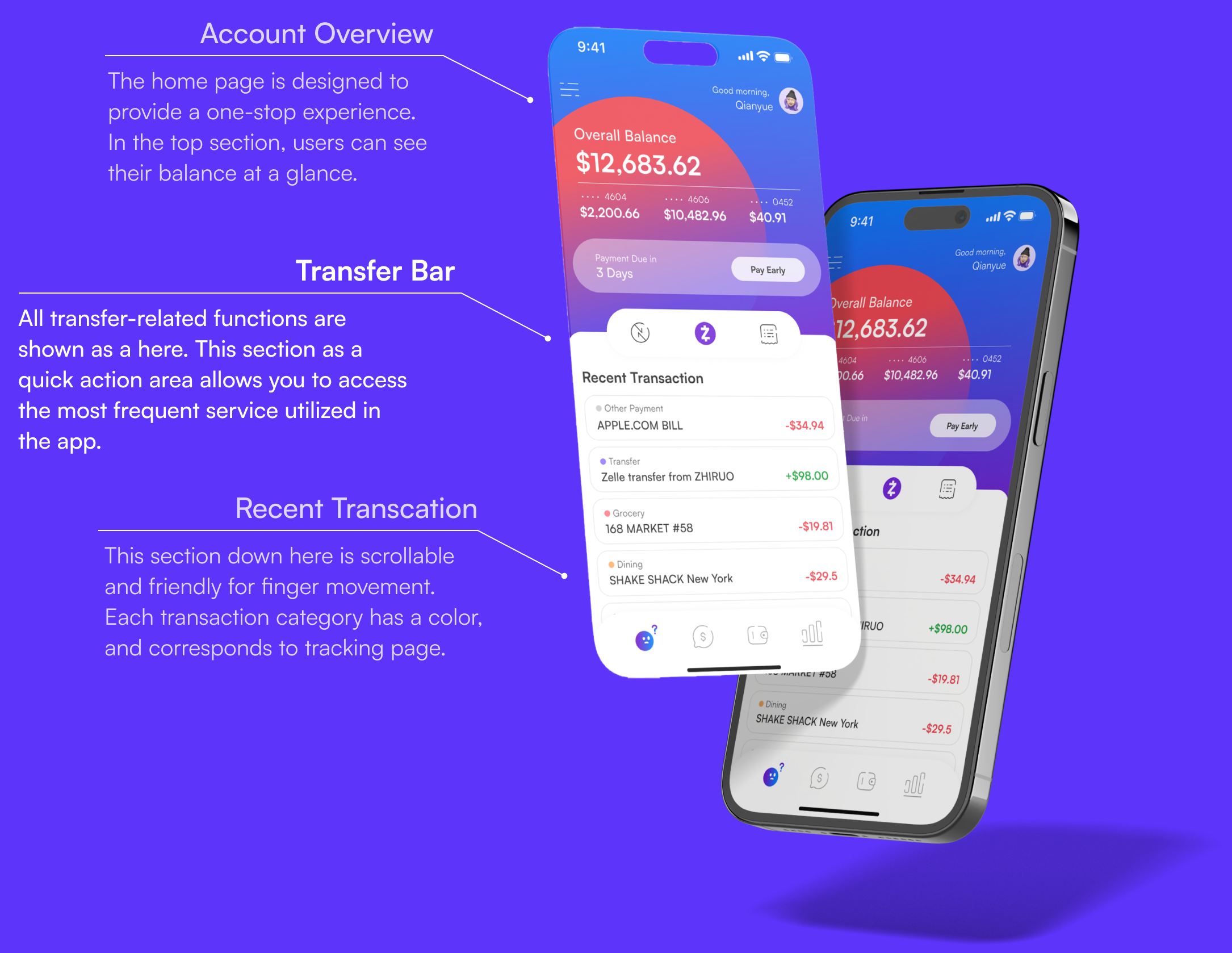
- Homepage -
Through data tracking, user interviews, tests, and our expertise, we have iterated our product three times, ensuring it caters to our users' needs.

- Tracking Page -

Design System

PROTOTYPE


Outcome
Task Completion Time
⬇**%
Task Completion Rate
⬆**%
User Satisfaction Rate
⬆**%
Retro & Next Step
This project was a great learning opportunity in designing for demographics like myself. On one level, it was an interesting experience because it gave me a lot of leverage to include some "I just like it" contents because I was representing TA's preferences to some extent. On another level, it forced me to think from the cutting edge of technology, including integrating AI into product thinking and UX design. It allows me to explore the implementation of personalization features and customize the app experience to each user's unique requirements.
Looking ahead, I plan to explore the integration of gamification elements to enhance user engagement when the opportunity arises. Features like rewards, badges, and other gamification elements can motivate users to interact with the app regularly. While the experience thus far has been satisfactory, we will still keep an eye on its performance. Also, if there is an opportunity, I am glad to introduce similar features directly into the product.